18CSE301J_RA2011030010094
<!DOCTYPE html>
IV Project Sample Visualizations using Python, D3, Tableu, Giphy
Here I've visualized my chosen dataset using different tools and platforms and uploaded some samples below.
Sudhersan K V (RA2011030010094)
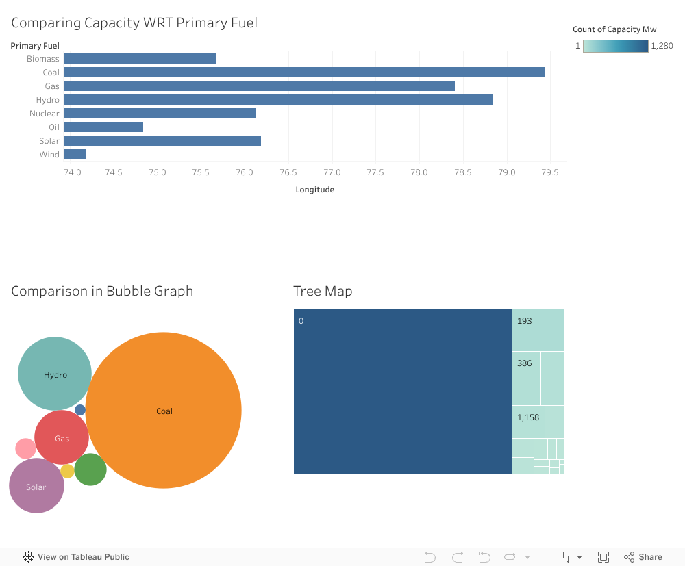
TABLEAU PROJECT
Python Project
Code:
import pandas as pd
import matplotlib.pyplot as plt
.
#Read the CSV file and store it in a DataFrame

df = pd.read_csv('indpowdata.csv')


#Group the data by primary fuel and sum the values in the 'Capacity MW' column for each primary fuel

grouped_data = df.groupby(['primary_fuel'])['capacity_mw'].sum()

#Plot the data

grouped_data.plot(kind='bar')

#Add x and y axis labels and a title

plt.xlabel('Primary Fuel')
plt.ylabel('Capacity (in MW)')
plt.title('Capacity by Primary Fuel in India')

#Show the plot

plt.show()

Python
Code:
Visualization of Capacity WRT Location in India
import matplotlib.pyplot as plt

#Create the scatter plot
plt.scatter(df['longitude'], df['latitude'], s=df['capacity_mw']*0.1, alpha=0.5)

#Add axis labels and a title
plt.xlabel('Longitude')
plt.ylabel('Latitude')
plt.title('Capacity (in MW) by Location in India')

#Show the plot
plt.show()
This adds a new heading for the second visualization and the code for creating a scatter plot of the capacity vs. location in India. The code block is again enclosed within pre and code tags to preserve the formatting and add syntax highlighting.
